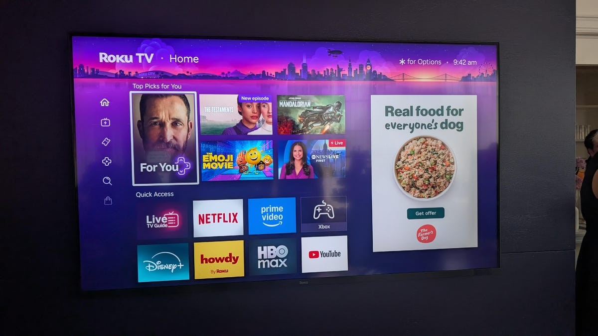
Ten years. That is how long it took. Roku just pulled the trigger on a massive UI overhaul. And yeah, there’s a billboard now. Big. Right there on your main screen.
“This is one of the most valuable pieces real estate in streaming”
— Preston Smalley, VP of Product, Roku
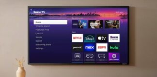
They called a press event in New York to show off the damage—or the improvement, depending on who you ask. Smalley’s logic holds water in boardrooms: half of broadband users stare at this screen, so it is prime advertising land. The ad marquee has migrated to the right side. It mixes paid placements with suggested shows. The ratio? Fluid. Not set in stone. And here is the kicker—you can’t hide it. Before, you only saw the ads when you dove into apps. Now, the text menu stays, but that ad strip? Permanent.
The rest of the layout tries to make up for it. You get a “For You” section at the top. A “Quick Access” bar at the bottom based on your favorite apps. Both are configurable. If you hate them, delete them. They disappear, leaving the traditional app grid. At least there is that.
Left side holds your standard controls. Search. Subscriptions. Nothing new.
But “For You” is the big pitch. Every streaming device tries to aggregate your life. Hulu here. Netflix there. Apple over there. It’s a mess. Roku wants to fix it. They are using AI, plus “saved” shows and “now watching” data from the services themselves. It’s a consolidation attempt. Will it work? Maybe.
Let’s be honest. The old interface looked tired. Dated, even. As a reviewer, I noticed the grain in the wood a while ago. As a viewer, I just wanted things to move faster. Customization might bring some users back from the Google TV or Amazon Fire crowds who crave a content-first approach.
It’s bound to upset loyalists. Change after a decade? Painful. But the ability to nuke the new widgets helps.
Rolling out in waves. Weeks or months. Want it now? Call customer support. Because nothing says modern convenience like holding a phone call to get a software update.