Words fail you. That’s the reality of digital communication. You send an email or a text, but the tone gets lost in the static. You need to convey sarcasm, affection, or sheer disappointment. A cartoon image of a pile of waste often does the job better than a paragraph. You need an emoji.
These graphic symbols have colonized our screens. They sit in text messages. They appear on websites. They even show up in physical spaces like Walmart and corporate offices. They provide context that plain text strips away. Without them, a message can feel cold or ambiguous. With them, it gains personality.
This isn’t about the old skinnies:smile: or 😥 you stitched together in the 90s. We’re talking about the full-color, high-resolution icons you see everywhere. On iPhones. On Androids. On desktop browsers. On movie posters.
Emojis are not a passing fad. They originated in the late 1990s. Today, they are spreading like wildfire. About 75% of Americans use them daily. Six billion of them are sent every single day. The trend started with a few simple faces. Now, it’s a complex language. Users pick from thousands of options to express nuanced feelings. It’s not just for teenagers. It’s a distinct style of communication.
The ABCs of Emojis
The Pre-Emoji Roots of Digital Expression
Emoticons preceded emojis by decades, serving as the original bridge between dry text and human nuance. Before we had colorful pictograms, we had ASCII art. A simple :-) or :-( conveyed happiness or sorrow. It was a functional hack.
Scott Fahlman, a computer scientist at Carnegie Mellon University, is credited with the first documented use. On September 19, 1982, he posted a suggestion on the university’s electronic bulletin board. He proposed using a colon, dash, and parenthesis to mark humorous comments. The goal was simple: prevent misunderstandings. Arguments were brewing because text lacked tone. Fahlman’s solution added a layer of context.
The idea spread. Other colleges adopted it. Then the wider internet did.
But the impulse isn’t new. People have been inserting emotional cues into handwriting for centuries. Some historians trace a proto-emoticon to a 1648 Robert Herrick poem titled “To Fortune.” The line reads: “Upon my ruins, (smiling yet :).” It’s a clever use of punctuation to mimic a facial expression.
The Shift to Pictograms
Emojis are the evolution of this concept. They replace alphanumeric characters with colorful icons. The result is visual. It’s no longer abstract symbols. It’s a picture.
The story begins in Japan. In 1995, NTT DoCoMo introduced icons for its Pocket Bell pagers. The devices were massively popular. The initial icons were minimal. A phone symbol meant “call me.” A heart symbol denoted affection.
It was a small change. A big impact.
The Teenage Exodus and Market Correction
DoCoMo eventually streamlined its offering. They dropped the icons. They viewed them as childish distractions from a business-centric product. It was a strategic misstep.
Japanese teenagers left. They migrated to a competitor called Tokyo Messaging. That platform allowed icons. DoCoMo realized too late that it had alienated a vital customer base. The market spoke loudly.
Standardizing Emojis: The Unicode Era
The fragmentation of early Japanese emoji systems created a new problem. Symbols looked different on different devices. This lack of standardization hindered global communication.
Enter Unicode. The Unicode Consortium works to unify character sets across platforms. By integrating emoji into the Unicode Standard, they ensured consistency. A smiley face on an iPhone now looks roughly the same on an Android phone.
This standardization was crucial for the global adoption of emoji. It transformed a niche Japanese feature into a universal language. The technical hurdles were cleared. The cultural barrier remained, but it was easier to cross.
We now use emoji in professional emails, casual texts, and marketing campaigns. The journey from a colon-dash-parenthesis to a high-resolution fruit bowl is long. It reflects our desire to be understood. Not just what we say, but how we feel.
The technology keeps changing. The need for emotional clarity remains constant.

Shigetaka Kurita wasn’t trying to change global communication. He was just trying to fit a news update into 250 characters.
That was the constraint. DoCoMo’s early mobile internet platform, i-mode, had a hard limit. Engineers needed to share stock prices and weather reports without choking the sluggish networks of the late 1990s. Text was too verbose. Images were too heavy for the bandwidth available.
Kurita, an engineer at DoCoMo, saw a gap. Why describe a cloudy day when you could show a tiny cloud?
In 1999, under tight deadlines, he designed 176 specific pictograms. Simple things. A sun. A fork and knife. A heart. He called them emoji, pulling from e (picture) and moji (character). It wasn’t just decoration. It was compression.
How DoCoMo Solved the Bandwidth Problem
Sending actual image files was impossible. The networks couldn’t handle it. The solution was clever in its simplicity.
The icons were preloaded onto the handsets.
When a user selected a symbol, the phone didn’t send a picture. It sent a two-byte code. That code pointed to the preloaded image on the receiver’s device. Two bytes. That’s nothing. It was a picture-driven conversation that didn’t drain data plans or time out on dial-up connections.
It worked. It was fast. It was cheap.
The Fragmented Early Days
But the system had a flaw. It only worked within DoCoMo’s ecosystem.
As mobile internet spread, interoperability vanished. If you sent a thumbs-up to a rival carrier’s user, you might get a thumbs-down. Or a question mark. Or nothing at all. The symbols were arbitrary. There was no shared dictionary.
Communication broke down. Or rather, it fractured.
The Unicode Solution
Standardization was the only way out.
In 2010, the Unicode Consortium stepped in. This non-profit group, made up of tech companies and linguists, decided to codify picture characters. They built a standardized library.
Now, Android, iOS, and Windows all speak the same underlying language. The code points are identical.
The artwork differs. Apple’s smiley looks different from Samsung’s smiley. Google’s look different again. But the meaning? The same. A laugh is a laugh. A heart is a heart.
This created a nearly universal system. We moved from proprietary, carrier-specific icons to a global standard.
They Call It ‘Crying With Laughter’
The technical shift was massive. The cultural shift was faster.
We stopped seeing these as just efficient text replacements. We started seeing them as tone. As emotion. As a way to soften a blow or amplify a joke.
But the fragmentation wasn’t fully gone. It just changed shape. Now, we have a standard code, but different interpretations of the visual output. And then there are the newer symbols. The skin tones. The gender variations. The new job titles.
The Unicode Consortium adds hundreds of new characters every year. The library grows. But the core problem remains.
How do you define a feeling that has no word? You draw a face.
Does it matter if the face looks slightly different on your iPhone versus my Android? Mostly no. We understand the intent.
But intent isn’t always clear. Sometimes a rolling on the floor laughing emoji is read as genuine amusement. Sometimes it’s read as dismissal. Sometimes it’s read as passive-aggression.
The technology solved the transmission problem. The social problem? That’s
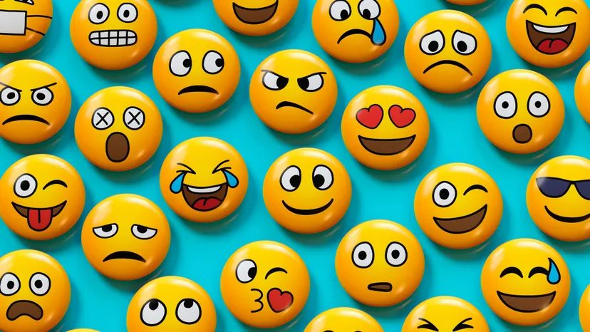
The Unicode Standard holds over 2,800 distinct emoji as of 2018. That number isn’t static. The Unicode Consortium reviews roughly 100 new proposals every single year. They aren’t just guessing. Promising symbols get uploaded to the Unicode website for public scrutiny. This step exists to filter out symbols that are inappropriate or too niche.
There are hard rules. The consortium rejects emojis featuring living people. Deities are off-limits. Business logos get tossed out too. If an idea survives this gauntlet, it lands in the emoji library. Software programmers and hardware vendors then get access to these assets.
Here is the thing about ownership. The consortium standardizes these glyphs, but they do not hold a trademark. There is no copyright. Emojis are open-source. Anyone can use them for any purpose. You can use them in commercial products without paying a dime.
This freedom explains why “The Emoji Movie” existed. Critics skewered it. It was probably best left on the drawing board. But the lack of IP protection means anyone can try. Most fail. Some stick.
Not every emoji earns its keep. The floppy diskette symbol. The analog telephone. Neither sees much use today. They are digital fossils.
Others dominate. In 2017, the “crying with laughter” face was the world’s most popular emoji for the third consecutive year. The basic heart symbol came in second. The laughing face was so ubiquitous that Oxford Dictionary named it the word of the year in 2015. It became more than a graphic. It became language.
How Japanese Culture Spawned the Emoji Boom
Why did this start in Japan? It comes down to specific cultural quirks. Japanese consumers adopted new smartphone concepts years before the rest of the world. They were early adopters by necessity and habit.
Then there is the aesthetic. There is a deep love for cute cartoon themes. Think manga. Think anime. The “Hello Kitty” craze didn’t just happen. It thrived in this environment. There is a specific term for this obsession with cuteness. It is called kawaii.
Combine early mobile adoption with kawaii culture and you get the cradle of emoji. The medium fit the message perfectly. Small screens needed small, expressive icons. The culture provided the design language.
The Scoop on Peaches and Poop
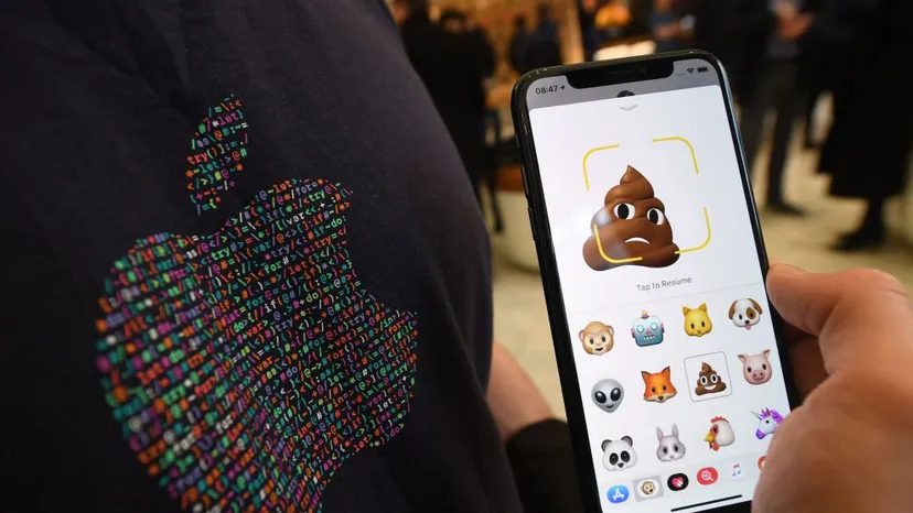
You can’t really wink via text. The pixels don’t support the nuance. That’s why 92 percent of internet users lean on emojis to inject emotional context into otherwise dry, ambiguous strings of characters. But knowing the slang is half the battle. Without it, you’re just sending random icons.
Take the peach. To a novice, it’s just a snack. To anyone who has spent more than five minutes online, the peach is a sly stand-in for human private parts. Pair that with an eggplant and the conversation takes a sharp, suggestive turn.
Then there is the poop emoji. It is the superstar of oddball icons. In the early 2000s, it was huge in Japan. A flexible tool for conveying dislike, suffering, or just pure hilarity without using explicit language. By 2007, Google added it to Gmail, complete with circling flies. Now it’s everywhere. You can buy poop hats. Bluetooth speakers shaped like poop. It’s bizarre, but effective.
Why Emoji Design Sparks Outrage
Avid users are fanatical. They notice every tweak. And sometimes, those tweaks cause a firestorm.
Because each tech giant creates its own version of the Unicode Consortium’s standards, the icons look different depending on your device. In 2017, Google released a “cheeseburger” icon where the cheese sat under the meat patty. The internet erupted. People were furious. The mistake was so glaring that CEO Sundar Pichai stated Google would “drop everything else we are doing” to fix the burger.
“In other words, emojis don’t just express emotions, they can inspire them, too.”
This proves that design matters. It’s not just about aesthetics. It’s about accuracy. A wrong layer of cheese can cost a company its dignity.
Who Uses What: Cultural and Demographic Breakdown
Emojis are powerful storytelling tools. But they also reveal who you are. A survey by Match.com claimed people who used emojis had more sex than those who didn’t. Hard data to back it up? Maybe not. But the correlation is clear.
Regional preferences vary wildly. In the U.K., the wine emoji is king. Americans favor the crown. Australians lean toward drug-related emojis. It’s a strange cultural map drawn in little cartoon pictures.
Skin tone options have also shifted. Initially, all emojis were white. Then, in 2015, the Unicode Consortium changed the default to a Simpsons yellow, allowing users to tint them into one of five skin tones. These were an immediate hit. Interestingly, the “pale skin tone” option has fallen out of favor in the U.S., even among white users. The default yellow seems to have taken over, though African-Americans and others still use darker skin tones. It’s a subtle shift in digital identity.
When Emojis Backfire: Legal and Professional Consequences
Misuse can mark you as immature. Or worse, out of touch. One study found that contrary to actual smiles, smiley emojis do not increase perceptions of warmth. They actually decrease perceptions of competence. Low competence undermines information sharing. Your coworkers might start questioning your intelligence if you overdo the grinning faces.
But the risks go beyond office politics. Digital emojis can have real, analog consequences. We aren’t talking about sending an eggplant to your mom. We’re talking about jail time.
Two South Carolina men were arrested in 2015. They used Facebook to send a specific sequence: a fist, a hand pointing, and an ambulance. Officials interpreted this as a threat to physical safety. The men had already tried to attack the homeowner at his residence. The emojis were evidence of intent.
In early 2016, a Frenchman was sentenced to three months in prison. He sent a handgun emoji to his ex-girlfriend. The court determined the message constituted a death threat. No gun was fired. No words were spoken. Just an icon.
The Cost of Miscommunication: A $2,000 Lesson
In Israel in 2017, a landlord received excited emojis from prospective renters. Champagne bottle. Squirrel. Other happy symbols. He assumed the deal was done. He removed the property from the market to accommodate them.
When the renters backed out, he sued in small claims court. He wanted to recoup the money he lost while the home was off the market. He won about $2,000 in damages.
The moral? A picture was worth at least $2,000. Ambiguity is expensive. If you’re not careful, your emoji could cost you everything.